Problem Statement
New Era Homes is a Dubai real estate advisory representing branded towers, waterfront residences and new launches from the city’s major developers.
They needed a modern way to present their latest portfolio to buyers and renters: one that matched the quality of the properties, made listings easy to browse, and put the essentials of each one, such as location, developer, status and starting price, in plain view.
Interest only matters if it turns into a conversation. The site had to make contacting an advisor effortless at every step, and work just as well on a phone as on a large screen.
Lead with the Lifestyle, Follow with a Listing
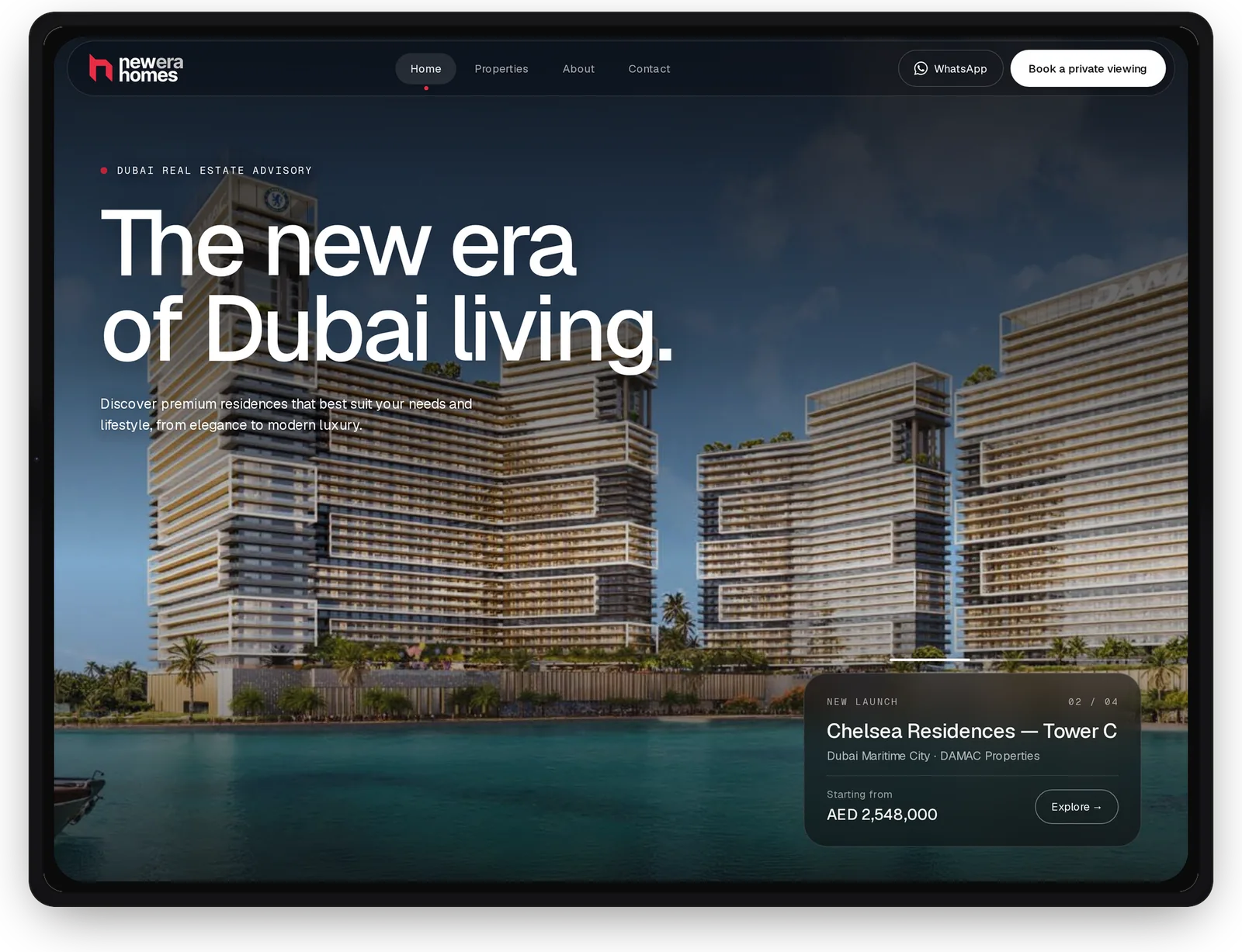
The homepage opens on full-bleed architecture and a single, confident headline. Buyers at this level are choosing a way of living, so the imagery makes the first impression and the copy stays out of its way.
A featured launch card sits in the corner with the project, area, developer and starting price, plus a counter showing it’s one of four. Within seconds, a visitor is looking at a real, priced property rather than a brand statement.
WhatsApp and “Book a private viewing” stay in the navigation on every page, so the next step is always in reach, whichever channel a buyer prefers.
One Listing Template, Any Property
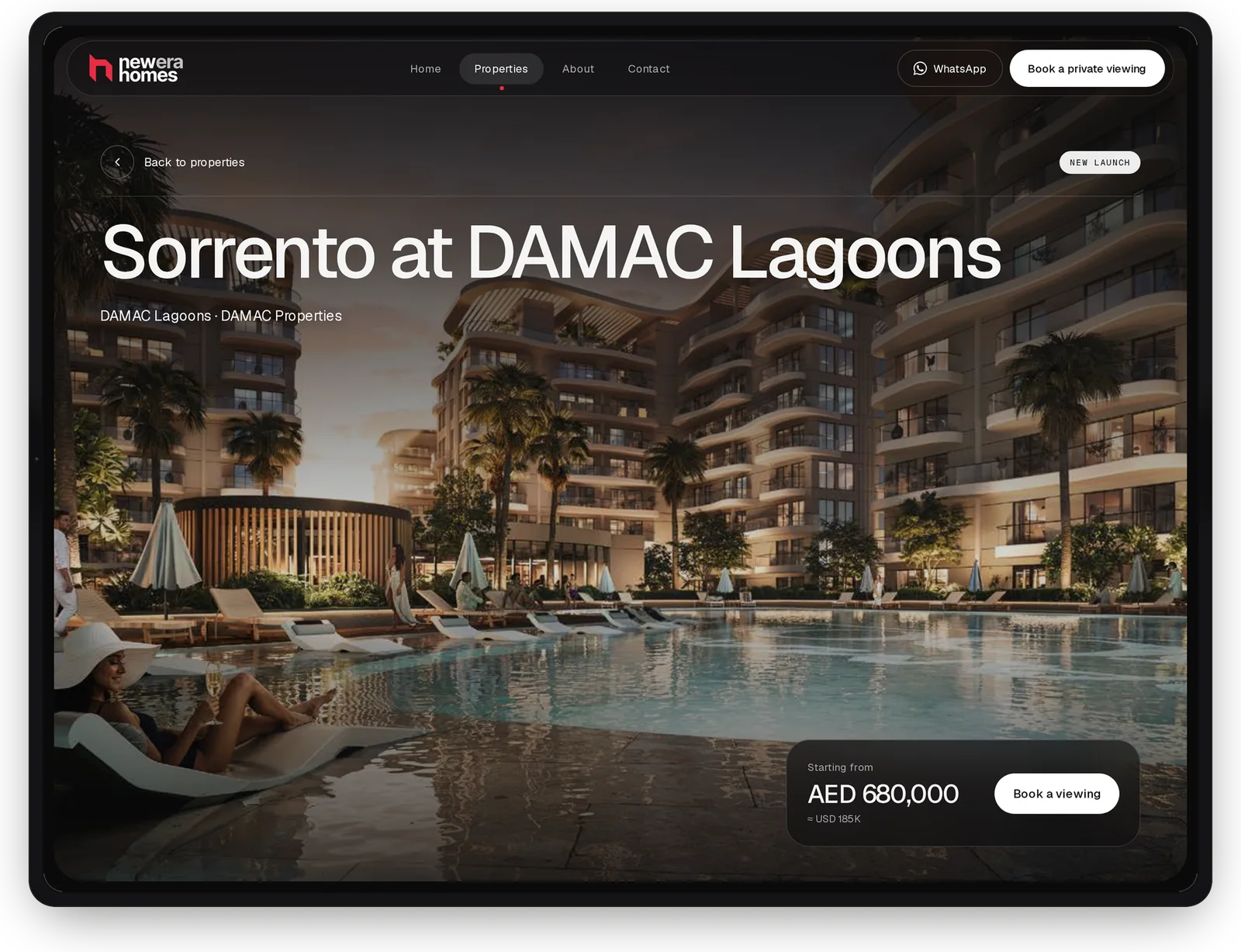
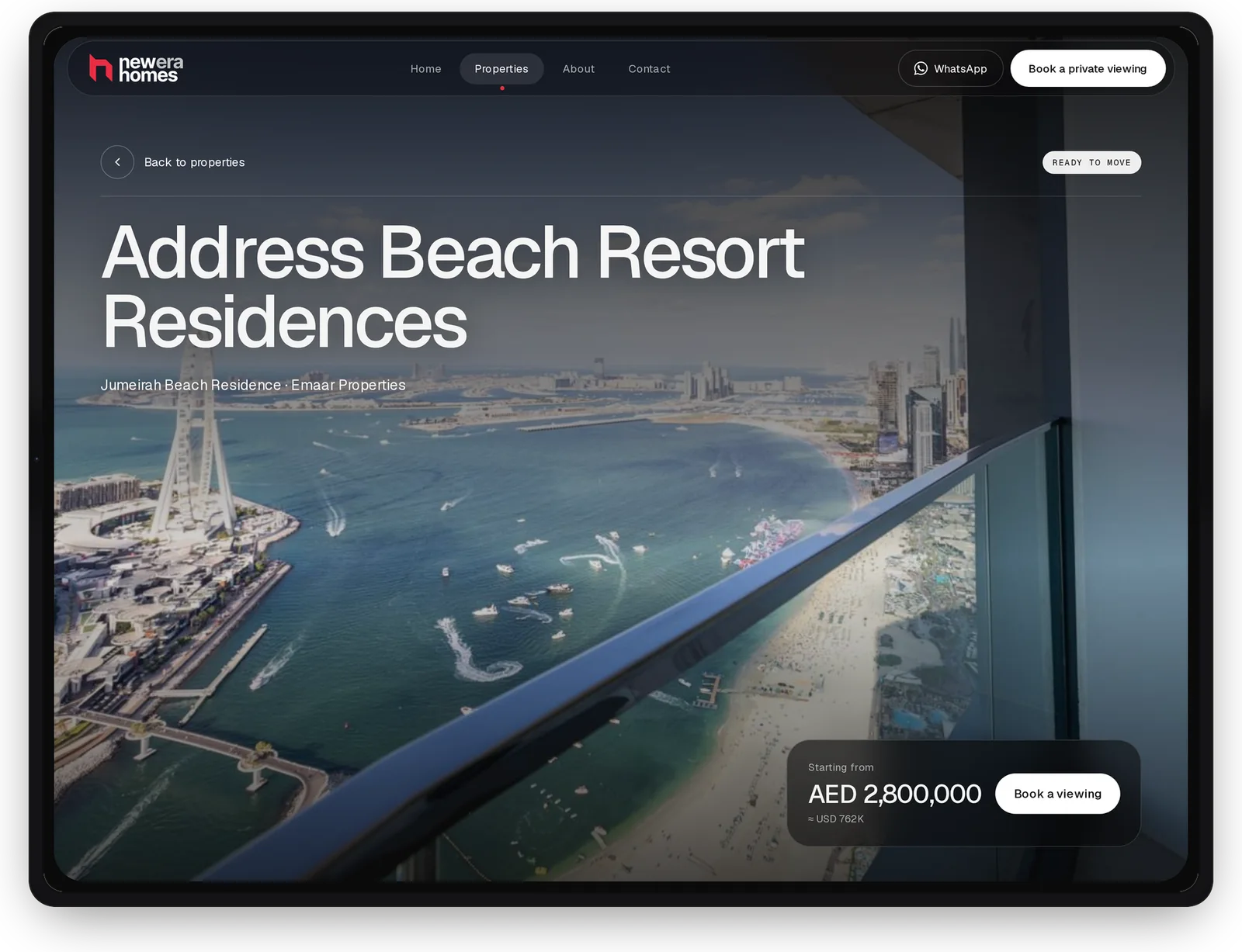
Every property page follows the same structure: a way back to the list, a status badge such as New Launch or Ready to Move, the project name with its area and developer, and a price card with a direct booking button. Buyers learn the layout once and can compare properties without hunting for details.
Prices appear in AED with a USD estimate for buyers abroad. For the client, adding a listing means filling in a template, not designing a new page.
Browsing That Matches How Buyers Shortlist
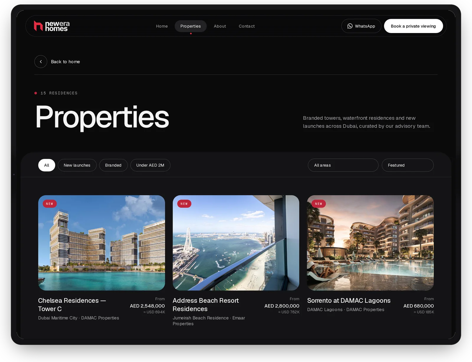
The Properties page is built around the questions buyers ask first: is it a new launch, is it branded, is it within budget, and where is it? Those became one-tap filters plus area and sort menus, in place of a long search form.
Each card follows the same order of image, name, area and developer, with the price aligned right so it can be scanned straight down the grid. A residence count tells visitors upfront how much there is to explore.
The current section is marked in the navigation with a highlighted pill and a red dot, so visitors always know where they are.
Showing Enough to Earn the Viewing
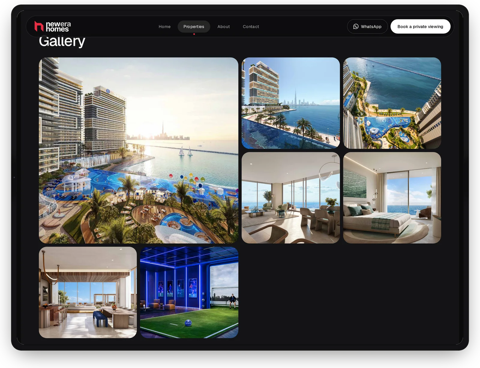
Each property gets a gallery that tells a short story. One large image sets the scene, then smaller frames cover the amenities, living spaces and bedrooms. The difference in size makes it obvious where to look first.
The aim is to answer most of a buyer’s questions before they ask them. When someone books a viewing, they already know what they’re coming to see, which makes better use of both their time and the advisor’s.
Room for the People Behind the Listings
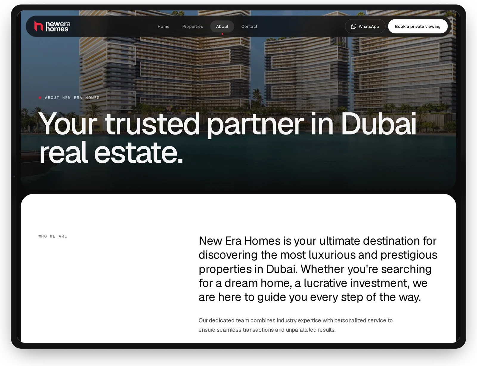
The About page opens with the same cinematic imagery, then switches to a white panel with large, high-contrast type. Moving from image-led to text-led tells visitors this part is meant to be read, not skimmed.
Property is a trust business. Giving the advisory’s story its own space, rather than squeezing it between listings, lets buyers get a sense of who they’ll be working with before they reach out.
Every Route Leads to a Conversation
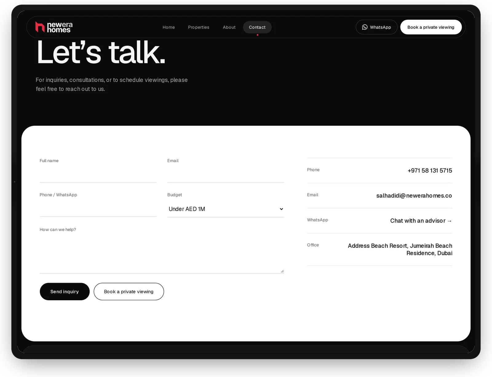
The contact page offers three ways in: a short enquiry form, WhatsApp, and a private viewing booking, with the phone number, email and office address alongside. Visitors choose the channel they’re comfortable with instead of being pushed into one.
The form asks only for what an advisor needs. A budget field gives useful context before the first reply without making the form longer, and every field has a visible label, so it stays clear and accessible as people type.
The goal was a site that helps buyers decide sooner and gives the advisor better-informed conversations.
Easier Property Discovery
Filters and consistent cards let buyers narrow the portfolio in a few taps.
Clear, Comparable Listings
Status, location, developer and price sit in the same place on every property.
An Advisor at Every Step
WhatsApp and private viewings are one tap away from any page.
Ready for New Launches
New properties slot into existing templates, so the portfolio can grow without redesign.